Page 1 of 5
New forum skin
Posted: Fri May 09, 2014 8:05 am
by slpwnd
Albert has prepared a new forum skin. You can check it out by going to User Control Panel -> Board Preferences -> My board style and changing the value (most probably prosilver) to factorio. This is a dark - orange skin more in line with the general feeling of the game. The option to use the old one (prosilver) will stay.
Please note that there might be some errors or unfinished stuff. If you find such a thing, please post it in the comments and we can repair it. We would also be eager to hear what you think. You can vote in the poll and give us your opinion about it ...
Re: New forum skin
Posted: Fri May 09, 2014 8:38 am
by rk84
Looks good. I have been waiting for dark skin. Thank you.
Re: New forum skin
Posted: Fri May 09, 2014 10:49 am
by ssilk
No problems till now. Looks really nice. When comes this skin for the wiki?

Critics at really very high level:
- Factiorio-logo and below the same (Forums -
www.factiorio.com), but don't know how to make it better - perhaps just something I need to get used to.
- I whish better visibility if you have a new message waiting
- better visibility for the search (there is enough space left)
Re: New forum skin
Posted: Fri May 09, 2014 11:52 am
by Tenebrous
I think it looks fantastic. Really does feel like it has the 'Factorio' character now.
Some of the text is too dark, but I'm assuming that's easily changed:
Re: New forum skin
Posted: Fri May 09, 2014 12:16 pm
by Drury
Been using subsilver2 style mainly because the avatars are on the left...
<-
...like
pretty much every internet forum I know of. Can't think of any exceptions.
On top of that the Windows cursor is the same shade of gray as message typing field, making it practically invisible while formatting.
Other than that, you can pat Albert on the back for this one, this is definitely one of the best skins I've ever seen.
Re: New forum skin
Posted: Fri May 09, 2014 2:36 pm
by WhiteZero
Tenebrous wrote:I think it looks fantastic. Really does feel like it has the 'Factorio' character now.
Some of the text is too dark, but I'm assuming that's easily changed:
Even more egregious

But overall it looks good, fits the game's theme. Just needs some tweaking.
Re: New forum skin
Posted: Fri May 09, 2014 3:44 pm
by ssilk
One point: Selecting text. if you select text it can't be read anymore (white & lightgrey).
Re: New forum skin
Posted: Fri May 09, 2014 3:56 pm
by slpwnd
Tenebrous wrote:I think it looks fantastic. Really does feel like it has the 'Factorio' character now.
Some of the text is too dark, but I'm assuming that's easily changed:
Yup, I also noticed this and couple of other things. I let Albert know already. The other things I noticed are:
1) "Post reply" button should say "New topic" when you don't have a specific topic opened.
2) After posting a topic the first line of text is not readable (grey over grey color). The same is when you click "mark subforums read" - you get a message and first line is not readable at all (that is easier to simulate than posting new posts I guess:))
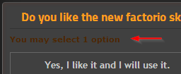
3) The red color used for "Posts", "Location", date of the post, "You may select 1 option" in the polls, etc. is kind of feeble ... not really readable. This doesn't have to be super visible, but probably more than now. (this is what you mentioned as well)
Guys keep posting the small issues you find here so we can get the style up and running soon

Re: New forum skin
Posted: Fri May 09, 2014 4:43 pm
by WhiteZero
ssilk wrote:One point: Selecting text. if you select text it can't be read anymore (white & lightgrey).
Really? In Firefox it's readable.
Re: New forum skin
Posted: Fri May 09, 2014 6:57 pm
by andzoak
Letters are to red to me. I think that yellow should be better.
Re: New forum skin
Posted: Fri May 09, 2014 7:16 pm
by ssilk
The problem depends only Firefox on MacOS:
Safari on Mac looks ok (Chrome looks identical)
I'll also have a deep look hw it looks on IPad...
Edit: looks pretty cool.
Re: New forum skin
Posted: Fri May 09, 2014 7:37 pm
by muzzy
Usability suffers quite a lot with the new skin. Contrasts are too low in a lot of places, hover effects are too strong (i.e. distracting) and so on. It feels unpleasant to use.
And the red "unread posts" icon in the board index page is painful to watch, it feels out of place.
Re: New forum skin
Posted: Fri May 09, 2014 7:55 pm
by slpwnd
muzzy wrote:And the red "unread posts" icon in the board index page is painful to watch, it feels out of place.
I am also afraid of that. I asked Albert to push the colors a bit (:/) because before it was too "integrated and invisible", but maybe it needs a bit more tweaking.
Re: New forum skin
Posted: Fri May 09, 2014 8:03 pm
by muzzy
slpwnd wrote:muzzy wrote:And the red "unread posts" icon in the board index page is painful to watch, it feels out of place.
I am also afraid of that. I asked Albert to push the colors a bit (:/) because before it was too "integrated and invisible", but maybe it needs a bit more tweaking.
You could try add a glow to make it distinguishable without being annoying. It's an activity indicator, after all.
Re: New forum skin
Posted: Sat May 10, 2014 2:31 am
by Albert
Salve Factorians!,
Here graphic Albert, I'm concerned about all those problems too. But with a bit more time, use and feedback they'll look just perfect. Promised.
I'm very aware about usability, don't think that is only about fanciness. But I tell you that phpBB forums is a huuuge site and full of details and variants. I just need some more time to test and repair.
Also I beg patience to the moderators cause they took the worst part, (not for long).
So thanks for the notifications and the screenshots and all the feedback. I hope to make good use of them and find the way to achieve the perfection that the Factorio's css deserves, or at least something decent and without any contrast/readability problems.
Just remember, if something looks weird, is because we're on alpha.

Re: New forum skin
Posted: Sat May 10, 2014 7:06 am
by ssilk
Hey Albert, this is a quite beautiful work. When this is the style, how the interface in game will look later, then I can say I like it. Don't exaggerate perfectionism.
Hehe, btw. "Perfect":
- the smilies are for white background
- factorio favicon is missing (
http://en.wikipedia.org/wiki/Favicon)
Re: New forum skin
Posted: Sat May 10, 2014 12:59 pm
by Albert
ssilk wrote:Hey Albert, this is a quite beautiful work. When this is the style, how the interface in game will look later, then I can say I like it. Don't exaggerate perfectionism.
Hehe, btw. "Perfect":
- the smilies are for white background
- factorio favicon is missing (
http://en.wikipedia.org/wiki/Favicon)
hi!
for the smilies you should refresh, they are all fixed for a dark bakground.
and the favicon, comes soon, i also want to see it there.
BTW, search bar is huge now : )
Re: New forum skin
Posted: Sat May 10, 2014 1:58 pm
by Speed
Could use some lighter text.
Re: New forum skin
Posted: Sat May 10, 2014 2:33 pm
by Balinor
WhiteZero wrote:ssilk wrote:One point: Selecting text. if you select text it can't be read anymore (white & lightgrey).
Really? In Firefox it's readable.
Readable in Chrome as well.
Re: New forum skin
Posted: Sat May 10, 2014 2:34 pm
by Blackjack1000K
i like it, looks great!